Monday, 26 January 2015

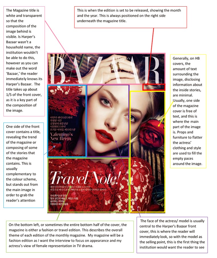
Double Page spread deconstruction


I have carried out some further research into the magazine articles in Harper’s Bazaar that carry on from the front cover. Before the interview, there is a double page spread introducing the celebrity, usually in an artistic and fashionable manner. One A4 side is committed to the magazine title and a short introduction, the other page of A4 commonly shows the celebrity in some form of photo-shoot, perhaps outside or in a studio, and usually heavily styled and specifically posed.

Keira Knightley Double page spread


Layout and Design

-The left hand side of the double page spread consist of a large ‘K’ in a large, black serif font which is the first initial of Kiera’s name, which fills the entirety of white space on the page. The black and white colours also complement the photon the right, which should be the main focus of the double page spread. I wish to use this style of font for my double page spread as it gives the page a creative, yet sophisticated edge which I feel displays the classy image that Harper’s Bazaar aim to convey.
- The small text on the left page introduces the actress/model and writes about her latest role in her new film. It discloses what the interviewer wishes to find out about Kiera Knightley and the main themes of the interview.
- A picture of Keira Knightley has been positioned on the right side of the double page spread. The colours used are fairly vibrant and eye catching, but avoids becoming ‘tacky’ through the use of a darker and plainer colour palette in the background. This appeals to the ‘fashionable and professional' target audience of Harper’s Bazaar who value high fashion photo-shoots, with models wearing the latest trends and designs. 
- The image is anchored with text that informs the reader who’s clothes Keira is wearing and the price, providing an immersive experience where readers can create a similar look through purchasing their own. The text is small and fairly faint, appealing to only those interested in what the actress, and isn’t too bold to distract those that aren’t. 

Double Page Spread Dedication


1) This part of the left hand page is dedicated to introducing the celebrity, whether it be their name or a catchy title. In this case it states ‘ A star is reborn’ which creates an enigma in which the reader wants to find out how Jenifer Aniston has recreated herself.
2)The text beneath the title elaborates on the title, stating how Jenifer is re-defining herself as a ‘funny girl’ and likens herself to Barbra Streisand who also plays a huge part in the comedy world.
3)This space is dedicated to text that credits the journalist who interviewed the celebrity and wrote the article and the photographer who took the pictures
4) Almost all the entirety of the right page is filled with an artistic image of the celebrity, for this feature Jenifer Aniston has paid tribute to Barbra Streisand by using a famous phot-shoot of her as inspiration for her own photo-shoot.
5)The right hand corner informs the reader who the clothes and jewellery are made by in the image of Jenifer.

Tuesday, 20 January 2015

Front Cover Space dedication


After searching the internet to find a recent front cover of Harper’s Bazaar I found this Amanda Seyfried cover from December 2012.  I have used boxes to show the different spaces dedicated to each component of the cover, which I must replicate on my own final production piece. This front cover shows particularly, how the main image fills the whole cover, whilst the text and the name of the magazine are much less important and less frequent in numbers, therefore showing that the image is the selling point of the magazine rather than 'catchy' titles.

Thursday, 15 January 2015

Harper's Bazaar Front Cover and Feature Image Research

I  have chosen to create a Harper's Bazaar Cover and two page spread, featuring an established actress who talks about her new role in a feminist police drama, in which she also directs. As it is a fashion magazine, the actress will be stylishly and fashionably dressed in the latest trends in order to meet the codes and conventions of the magazine and also appeal to the audience. The magazines target audience is primarily women ages 25-49 in the socio economic groups A,B and C, they claim that 'Harper’s BAZAAR is the style bible for the well-dressed woman with the well-dressed mind. It is a fashion authority. It unapologetically celebrates luxury fashion and beauty while profiling the who’s who of pop culture — fashion, photography, celebrity, art and literature. BAZAAR doesn’t stand still.'

In order to gain a wider understanding of what a Harper's Bazaar magazine is composed of and the type of articles it contains, I carried out some secondary research analysing covers and feature images from the latest editions of the magazine.

Claire Danes, October 2014


This feature on Claire Danes reveals all the inside information of her Showtime series ‘Homeland’ and how she relates to her character. The images are all shot in black and white, creating a professional and classy portrayal of the actress. She is styled modestly, with little skin and cleavage on show to appeal to a female audience who will be interested in the article rather than viewing her as an object to be looked at.  The colour scheme used if fairly basic, but balances well with the black and white background. The titles of articles around the main image is in a bold black serif font, contrasting to her pale skin and the white background. The yellow and pink font, highlighting the magazine name and type of magazine, contrasts one another creating a flattering colour scheme, but also contrasts the black and white background, making it appear bolder and more eye catching.  The titles used around the image are also very basic, without revealing too much information on the front cover so that it clutters the page. Short and concise titles must be used that have a large impact by creating an enigma for the reader, titles such as ' The most beautiful clothes in the world' will immediately entice a fashion fanatic. The feature images are consistent with the front cover, following with the black and white theme. Again, the images are very classy and fashionable, appealing to the audience. There are a range of close up, medium shot and long shot images, all of which display her in different styles of clothing in different positions, and also representing her in different ways  

Jenifer Lawrence , November 2014


Unlike the Claire Danes cover, Jenifer Lawrence’s portrait has been shot in colour, however the range of colours used are fairly dark in hue with an unsaturated tone to the image, which contrasts well with her bold plum lips.  Again, a close up shot has been used of the actress, providing a trend of the type of images Harper’s Bazaar tend to use on their front cover. Her facial expression is posed, yet looks fair and relaxed; it is also clear that hands and are generally apart of the shot to create an elegant, sophisticated feel to the image. A single coloured white font has been used throughout the cover, unlike the Claire Danes edition, in order to appear bright against the overall dark coloured image. This has shown to me that the colour of the font on Harper’s Bazaar front cover is usually just relative to the image, and what blends or contrasts well, rather than a set colour scheme. The titles used around the image are also very minimal in comparison to the October 2014 edition, which highlights that Jenifer Lawrence’s own popularity has enough magnitude to entice an audience. The stunning photo in conjunction with well-known name immediately sells the magazine, without the use of catchy headlines to create an enigma. It is apparent that from both magazines, the front cover images has to translate high fashion. The image I produce must be shot professionally in a studio, where the model is dressed fashionably with the appropriate hair and makeup- without this, my front cover will not be convincing as a Harper’s Bazaar edition.  The images of Jenifer Lawrence within the magazine are consistent with the front cover image in the sense that they are professional and classy. However they do not follow the colour scheme of the front cover image, and they are much more posed than Claire Danes' images. Some have been shot in colour and some in black and white, showing that the images don't have to be consistent with the front cover image or with each other, to some extent.


Analysis into these two magazine covers has allowed me to establish the generic codes and conventions that each magazine follows, and also the components that can be changed to suit each edition. With now a strong knowledge of the codes and convention of the style of the magazine, I would like to investigate into the content of the articles and Harper's Bazaar interviews.

Wednesday, 14 January 2015

Harper's Bazaar

Codes and Conventions:
Harper’s Bazaar is well known for its high fashion approach to celebrity interviews; prioritising professional, trendy photo shoots of A-list celebrities, and interviews of their first hand thoughts and feelings on their current projects rather than commenting on gossipy rumours and elaborated scandals.


The Front Page of Harper’s Bazaar is image based; the context of a front page headline is limited with small fonts and the main picture dominating the page. The front cover usually consists of an attractive colour palate, with complementing font of feature titles and the magazine logo. The page as a whole follows a flexible but simple format with the layout being minimal so that all focus is on the main image to attract the audience.
- Image dominates the front page (normally an actress or model, something to appeal to fashion fanatics and die hard movie fans)
- Relatively small and discrete font for titles (small enough to not outshine the image but large enough to be bold and visible to the audience)
- Harper’s Bazaar logo/ title (usually transparent in colour)
Overall, the images to text balance is around 85% image based to 15% text based. This reflects the target audience of mostly females and some males whom are interested in high fashion photography or those interested in the model/actress themselves.

Monday, 12 January 2015


Practical Production Piece - Planning


I am going to design and produce a 3 page magazine spread, including the front cover and feature story of fashion magazine Harper’s Bazaar. To relate to my written Critical Analysis, the piece will be an article interviewing the female lead of a well-established feminist TV drama, and how her life compares to her role. I intend to analyse various editions of Harper’s Bazaar and perhaps similar fashion magazines in order to achieve the desired outcome of a magazine that looks professional, has high production values and uses the typical codes and conventions of the magazine. The conventions in which I will focus on in order to illustrate my critical investigation are:
  • General layout of the interview articles and front cover
  • Written style, using the appropriate style of language
  • Style of images included on the front cover and within the article
  • Design, colours, style and fonts used
  • Magazine icons (i.e. re producing the logo, title and exact style of Harper’s Bazaar)
  • Target audience and relevance to my critical investigation of female representation in TV drama