Showing posts with label Analysis. Show all posts

Wednesday, 4 February 2015

Article Deconstruction


In order to gain further understanding to how each celebrity interview was layer out in Harper's Bazaar, I purchased the latest edition which showed a series of articles positioned on a double page spreads. The magazine has showed me the type of font used for the article, the positioning of the text and what images are used to accompany it. Below is a deconstruction of both the text layout and accompanying image.


1)      The article is laid out the same as the double page introduction before; text on the left and image on the right. This follows through for the rest of the feature and provides an equal balance between information for the reader with a glamorous and stylish image. This is pleasing to the eye and conforms to the codes and conventions of a fashion magazine as readers will be interested in the clothes and accessories the celebrity is wearing and also the latest changes in their personal life.

2)    The text is displayed in two columns, the first slightly lower, creating a more fashionable edge to the block of text. The article text is Times New roman, a basic, common san serif font that will be easy to duplicate for my own article.  In addition to this there is a white box, which usually contains an impacting statement for those that just skim read the article. The text may also entice the reader to read on, as the statement is usually catchy. In this case it states “‘Chris was only 25 when we met. Too young’ she says ‘Men are very young for their age’” Commenting of recent changes in her personal life, this will immediately attract her fans and those interested in the ‘gossipy’ side of celebrity.

3)      The image used to anchor the text of the right side of the article is black and white with a slight sepia filter. Unlike other images I have analysed, these are not consistent with the image on the front cover which is in colour. The image has been taken from a medium shot showing her upper body, which again does not follow the trends vie seen so far, as they are generally full body shots to show the reader what they are wearing. The image is unlike typical ‘model’ shoots as Gwyneth is smiling, however it displays her personality well which I think is what the article is trying to convey.

4)      A small block of text anchors the image, telling the reader where each accessory or clothing item is from and how much its costs, promoting synergy between the magazine and the brands it advertises through celebrity photo-shoots.

Monday, 26 January 2015

Double Page spread deconstruction


I have carried out some further research into the magazine articles in Harper’s Bazaar that carry on from the front cover. Before the interview, there is a double page spread introducing the celebrity, usually in an artistic and fashionable manner. One A4 side is committed to the magazine title and a short introduction, the other page of A4 commonly shows the celebrity in some form of photo-shoot, perhaps outside or in a studio, and usually heavily styled and specifically posed.

Keira Knightley Double page spread


Layout and Design

-The left hand side of the double page spread consist of a large ‘K’ in a large, black serif font which is the first initial of Kiera’s name, which fills the entirety of white space on the page. The black and white colours also complement the photon the right, which should be the main focus of the double page spread. I wish to use this style of font for my double page spread as it gives the page a creative, yet sophisticated edge which I feel displays the classy image that Harper’s Bazaar aim to convey.
- The small text on the left page introduces the actress/model and writes about her latest role in her new film. It discloses what the interviewer wishes to find out about Kiera Knightley and the main themes of the interview.
- A picture of Keira Knightley has been positioned on the right side of the double page spread. The colours used are fairly vibrant and eye catching, but avoids becoming ‘tacky’ through the use of a darker and plainer colour palette in the background. This appeals to the ‘fashionable and professional' target audience of Harper’s Bazaar who value high fashion photo-shoots, with models wearing the latest trends and designs. 
- The image is anchored with text that informs the reader who’s clothes Keira is wearing and the price, providing an immersive experience where readers can create a similar look through purchasing their own. The text is small and fairly faint, appealing to only those interested in what the actress, and isn’t too bold to distract those that aren’t. 

Double Page Spread Dedication


1) This part of the left hand page is dedicated to introducing the celebrity, whether it be their name or a catchy title. In this case it states ‘ A star is reborn’ which creates an enigma in which the reader wants to find out how Jenifer Aniston has recreated herself.
2)The text beneath the title elaborates on the title, stating how Jenifer is re-defining herself as a ‘funny girl’ and likens herself to Barbra Streisand who also plays a huge part in the comedy world.
3)This space is dedicated to text that credits the journalist who interviewed the celebrity and wrote the article and the photographer who took the pictures
4) Almost all the entirety of the right page is filled with an artistic image of the celebrity, for this feature Jenifer Aniston has paid tribute to Barbra Streisand by using a famous phot-shoot of her as inspiration for her own photo-shoot.
5)The right hand corner informs the reader who the clothes and jewellery are made by in the image of Jenifer.

Tuesday, 20 January 2015

Front Cover Space dedication


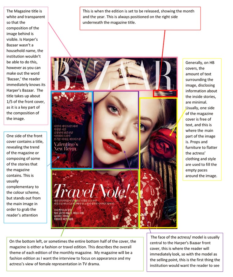
After searching the internet to find a recent front cover of Harper’s Bazaar I found this Amanda Seyfried cover from December 2012.  I have used boxes to show the different spaces dedicated to each component of the cover, which I must replicate on my own final production piece. This front cover shows particularly, how the main image fills the whole cover, whilst the text and the name of the magazine are much less important and less frequent in numbers, therefore showing that the image is the selling point of the magazine rather than 'catchy' titles.

Wednesday, 14 January 2015

Harper's Bazaar

Codes and Conventions:
Harper’s Bazaar is well known for its high fashion approach to celebrity interviews; prioritising professional, trendy photo shoots of A-list celebrities, and interviews of their first hand thoughts and feelings on their current projects rather than commenting on gossipy rumours and elaborated scandals.


The Front Page of Harper’s Bazaar is image based; the context of a front page headline is limited with small fonts and the main picture dominating the page. The front cover usually consists of an attractive colour palate, with complementing font of feature titles and the magazine logo. The page as a whole follows a flexible but simple format with the layout being minimal so that all focus is on the main image to attract the audience.
- Image dominates the front page (normally an actress or model, something to appeal to fashion fanatics and die hard movie fans)
- Relatively small and discrete font for titles (small enough to not outshine the image but large enough to be bold and visible to the audience)
- Harper’s Bazaar logo/ title (usually transparent in colour)
Overall, the images to text balance is around 85% image based to 15% text based. This reflects the target audience of mostly females and some males whom are interested in high fashion photography or those interested in the model/actress themselves.